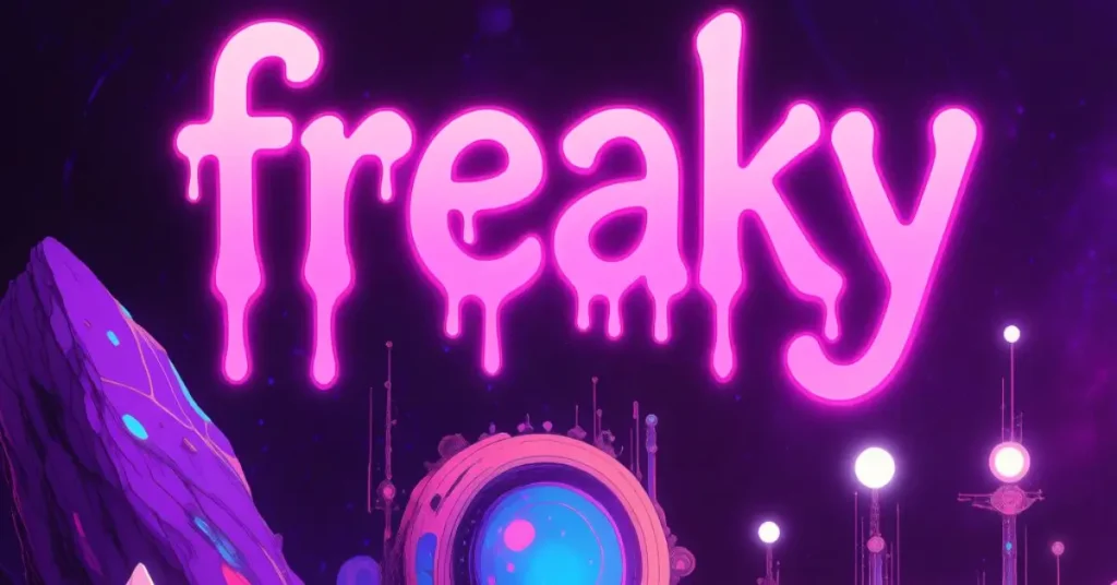

Freaky Fonts: What They Are, Where to Find Them, and How to Use Them Well
Typography does more than convey words. It sets a mood before a single sentence is read.
The font choice in any design project communicates something to the viewer the moment they see it. Clean sans-serifs feel modern and professional. Classic serifs feel established and authoritative. And freaky fonts? They immediately signal something different, something dramatic, unsettling, playful, or dark, depending on the specific style.
The problem most designers and creative beginners run into is not finding freaky fonts. There are thousands of them available. The problem is knowing which style fits a specific project, how to use them without destroying readability, and where to find high-quality options that are free for the intended use.
This guide covers all of that clearly. You will learn what defines a freaky font, the main style categories and when each works best, where to find reliable sources, and how to use bold decorative typography in ways that actually serve your creative goals rather than working against them.
A freaky font is a decorative typeface designed to evoke unusual, unsettling, dramatic, or unconventional emotions rather than communicate straightforward information. These fonts use distorted letterforms, horror-inspired styling, gothic scripts, dripping effects, glitch aesthetics, or extreme decorative elements to create a strong visual atmosphere. They are widely used in Halloween designs, horror branding, gaming graphics, social media content, and creative personal projects.
Quick Summary
Freaky fonts are decorative typefaces built for atmosphere rather than neutral communication. This guide covers the main style categories, the best use cases for each, where to find quality options for free and commercial use, and the most important rules for using them without ruining readability or design quality.
What Makes a Font Freaky?
The word freaky in typography covers a wide range of visual styles that share one common quality: they draw immediate attention and communicate a strong emotional tone before the content is read.
This is fundamentally different from utility typography, which aims to be invisible in the sense that readers absorb the content without consciously thinking about the letters carrying it. Freaky fonts do the opposite. The letterform itself is part of the message.
What specific visual characteristics create this effect? Several design approaches are at play across different styles.
Distortion and irregularity. Letters that deviate from standard proportions, that lean unpredictably, that have uneven strokes or deliberately broken forms, create visual tension that reads as unsettling or intense.
Horror-inspired details. Dripping effects, claw marks through letters, bloody textures, and bone-like serifs all borrow visual language from horror genre conventions to establish an immediate tonal association.
Gothic and blackletter elements. The heavy, angular strokes of traditional gothic typography carry centuries of association with the dramatic, the dark, and the medieval, which makes them a natural foundation for freaky and horror-adjacent designs.
Glitch and digital distortion. More contemporary freaky fonts use digital distortion, scan lines, data corruption aesthetics, and fragmented letterforms to create an unsettling modern edge distinct from traditional horror styles.
Extreme decorative complexity. Some freaky fonts are less about darkness and more about sheer visual intensity, highly ornate scripts, elaborate texture fills, exaggerated swashes, and intricate details that overwhelm in an intentional and dramatic way.
Main Freaky Font Style Categories
Understanding the style categories makes it much easier to choose the right font for a specific project rather than scrolling through hundreds of options without a clear sense of what fits.
Classic Horror and Drip Fonts
These are the typefaces most people picture when they hear the words spooky or Halloween font. They feature letterforms that appear to drip, bleed, or decay. The visual cues are borrowed directly from horror movie poster traditions and classic monster imagery.
Best for: Halloween event posters, horror party invitations, costume contest graphics, haunted house promotions, and any project where an immediate and obvious horror connection is the goal.
Readability limit: These fonts work well at large display sizes and for short text. They become illegible quickly at small sizes or in long passages.
Gothic and Blackletter Fonts
Gothic typography has a long history that predates horror associations entirely. These fonts were the standard text typefaces of medieval Europe. Their dark, angular, heavily stroked letterforms were later adopted by horror and heavy metal visual culture, giving them their current dual identity as both historically legitimate and visually intense.
Best for: Band posters, tattoo-inspired designs, gothic event branding, dark fantasy projects, and high-end horror aesthetics that want visual weight without the cartoonish quality of drip fonts.
Readability limit: Blackletter is genuinely harder to read than modern typefaces for readers unfamiliar with the style. Use at display sizes only and keep body text in a contrasting readable font.
Glitch and Distortion Fonts
This category covers freaky fonts that draw from digital aesthetics rather than traditional horror imagery. Fragmented letters, scan line effects, corrupted text appearances, and VHS-era distortion all fall within this style.
Best for: Gaming projects, tech-horror aesthetics, cyberpunk designs, social media graphics targeting younger audiences, and any project where digital unease is the intended mood rather than supernatural horror.
Readability limit: Glitch fonts vary widely in their legibility. Some are entirely readable with a single subtle effect. Others are so heavily distorted that they function as texture rather than text.
Handwritten Creepy Scripts
These fonts mimic handwriting but with an unsettling quality. Uneven baseline, inconsistent letter sizing, scratchy stroke textures, and erratic spacing make these feel like writing from someone or something that should not be writing.
Best for: Found footage aesthetic projects, thriller book covers, psychological horror designs, escape room graphics, and projects where subtle wrongness is more effective than obvious monster imagery.
Readability limit: Generally more readable than drip or heavily distorted fonts, making them a good choice when legibility matters alongside atmosphere.
Grunge and Texture Fonts
Grunge typography uses rough, worn, and textured letterforms that feel aged, damaged, or decayed. These are not always overtly frightening but create an unsettled, gritty quality that works well in darker creative contexts.
Best for: Music posters, vintage horror-adjacent designs, urban graphic projects, and any context where worn authenticity and rough texture serves the brand or creative direction better than polished design.
Best Use Cases for Freaky Fonts
Knowing when to use a freaky font is as important as knowing which style to choose.
| Use Case | Recommended Style | Key Consideration |
|---|---|---|
| Halloween party invitation | Classic drip or horror font | Keep text short and size large |
| Horror movie poster design | Gothic or drip font | Use with clean body text font |
| Gaming channel graphics | Glitch or distortion font | Ensure channel name remains legible |
| Tattoo design lettering | Blackletter or gothic | Consult artist on final sizing |
| Social media Halloween content | Handwritten creepy or drip | Test readability on mobile screen size |
| Horror podcast branding | Gothic or grunge | Needs to work at small logo sizes |
| Escape room signage | Handwritten creepy or gothic | Prioritize legibility over atmosphere |
| Personal creative project | Any style that fits the mood | No commercial use restrictions to consider |
Where to Find Quality Freaky Fonts
Finding fonts is easy. Finding quality fonts from legitimate sources with clear licensing is where many people make costly mistakes.
Google Fonts
Google Fonts is a free, open-source font library that includes a selection of gothic and display fonts suitable for darker design projects. Every font here is free for personal and commercial use, which removes licensing uncertainty entirely.
The selection of genuinely freaky fonts is more limited here than on dedicated font platforms, but the reliability and licensing clarity make it an excellent starting point.
DaFont
DaFont is one of the largest free font libraries available and has an extensive collection of horror, gothic, and freaky font styles specifically. The categorization makes browsing by style straightforward.
The critical caveat with DaFont is that licensing varies by font. Each font on the platform has its own license, and many are free for personal use only. If you are using a font for commercial purposes, including client work, products for sale, or monetized content, you must check the specific license for each font before using it.
Font Squirrel
Font Squirrel curates fonts that are explicitly cleared for commercial use. The selection is more carefully filtered than DaFont, which makes it slower to browse but significantly safer for commercial design work.
For designers working on client projects who need dark or decorative typography, Font Squirrel is a more reliable source than platforms with mixed licensing.
Creative Market and MyFonts
These are paid font marketplaces where independent designers sell high-quality typefaces. The freaky and horror font selection on both platforms is excellent, and paid fonts typically come with clear commercial licenses and professional quality that free options sometimes lack.
For professional projects where the font choice matters significantly to the final result, investing in a paid font from a verified creator is worth the cost.
How to Use Freaky Fonts Without Ruining Your Design
A great font used poorly still produces a poor result. These are the design principles that matter most when working with dramatic decorative typography.
One freaky font maximum per design
Using multiple decorative fonts in the same layout creates visual chaos rather than drama. Choose one freaky font for your primary display text and pair it with a clean, simple secondary font for any supporting text that needs to be read easily.
A Halloween poster in Nashville that uses a dripping horror font for the event name and a simple clean sans-serif for the date, time, and location details will communicate both atmosphere and information effectively. The same poster with three different horror fonts will communicate neither.
Size matters enormously
Freaky fonts are display fonts. They are designed to be seen at large sizes where their detail and character can be appreciated. At small sizes, the same details that make them visually interesting become visual noise that makes them unreadable.
Test any freaky font at the actual size it will appear in your final design before committing to it. What looks great at full screen on a design platform may be completely illegible at the size it actually appears on a printed flyer or a phone screen.
High contrast backgrounds
Detailed and decorative letterforms need contrast to read clearly. Dark fonts on light backgrounds or light fonts on dark backgrounds with minimal pattern interference give freaky fonts their best chance of being both visible and legible.
Avoid placing highly decorative text over complex photographic backgrounds or busy patterns unless legibility is genuinely secondary to texture in that specific design element.
Short text only
Freaky fonts are for headlines, event names, titles, and short phrases. Nobody should ever be asked to read a paragraph in a drip font or a full sentence in heavily distorted glitch typography.
Keep display font usage to five to ten words maximum. Move everything else to a complementary body font that prioritizes readability over atmosphere.
Test on actual devices and in actual contexts
Designs look different on screen than in print, different on desktop than on mobile, and different in digital mockups than on physical materials. Always test how your freaky font choice actually performs in the context where the final design will be seen before finalizing your selection.
Common Freaky Font Mistakes to Avoid
A few specific mistakes come up repeatedly when people use decorative fonts for the first time.
Using a freaky font for body text. This is the most common mistake. Decorative fonts are for headlines and display text only. Never use them for paragraphs or any text longer than a short phrase.
Ignoring licensing for commercial use. Using a personal-use-only font on a commercial project creates legal exposure. Always check licensing before using any font for client work, products, or monetized content.
Choosing based on appearance without testing readability. A font that looks incredible in a preview may be unreadable at the size you actually need it. Always test at real-world sizes before committing.
Overusing the effect. A freaky font is effective because it is different from the clean typography around it. If everything in the design is freaky, nothing feels special. Contrast is what makes decorative typography work.
Conclusion
Freaky fonts are powerful creative tools when used with intention and restraint. The key is understanding that a dramatic font is only effective when it serves the project’s emotional goal and when it is surrounded by design decisions that let it do its job without fighting against itself.
Find the right style for your specific project, source it from a legitimate platform with appropriate licensing, use it at the right size, keep text short, and pair it with clean typography for everything else. That combination consistently produces results that are both visually striking and genuinely effective.
Typography is one of the most underrated creative decisions in design. A great freaky font choice, used well, can make the difference between a forgettable design and one that people actually remember.
Frequently Asked Questions
What is a freaky font?
A font is a decorative typeface with horror, gothic, glitch, or spooky styles used for Halloween, gaming, branding, and creative designs.
Where can I find free freaky fonts?
You can find free fonts on Google Fonts, DaFont, and Font Squirrel. Always check the license before commercial use.
Can I use freaky fonts commercially?
Yes, if the font includes a commercial-use license. Many free fonts are for personal use only.
Which font style is best for Halloween?
Dripping horror fonts and creepy handwritten styles are the most popular choices for Halloween-themed designs.
How can I make a font easy to read?
Use it for short headings, increase the font size, maintain high contrast, and pair it with a simple body font.
What’s the difference between gothic and horror fonts?
Gothic fonts have a classic blackletter look, while horror fonts feature spooky effects like drips, cracks, and distressed details.